YOUR LOGO ISN'T YOUR BRAND. SORRY!
A founder walks into a design studio, hands over a mood board, and six weeks later walks out with a logo, a colour palette, and a font pairing. They call this “getting branded.” It’s a nice-looking file. It is not a brand.
THE EXPENSIVE CONFUSION
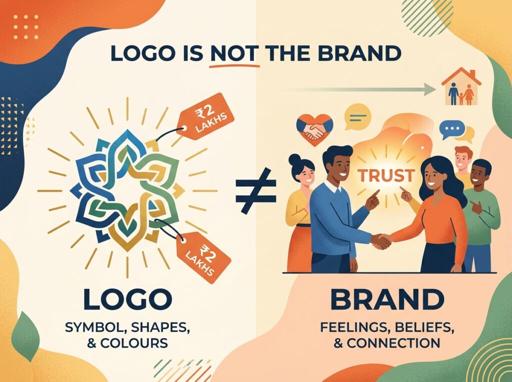
This mix-up costs businesses real money because it diverts investment to the wrong problem. A logo is a symbol. A brand is what people feel and believe about your business before they’ve even spoken to you. You can spend two lakhs on a beautiful identity and still lose to a competitor with an ugly logo and a sharper story, because customers don’t buy shapes and colours. They buy trust, and trust is built somewhere the logo never touches.
WHAT ACTUALLY BUILDS A BRAND
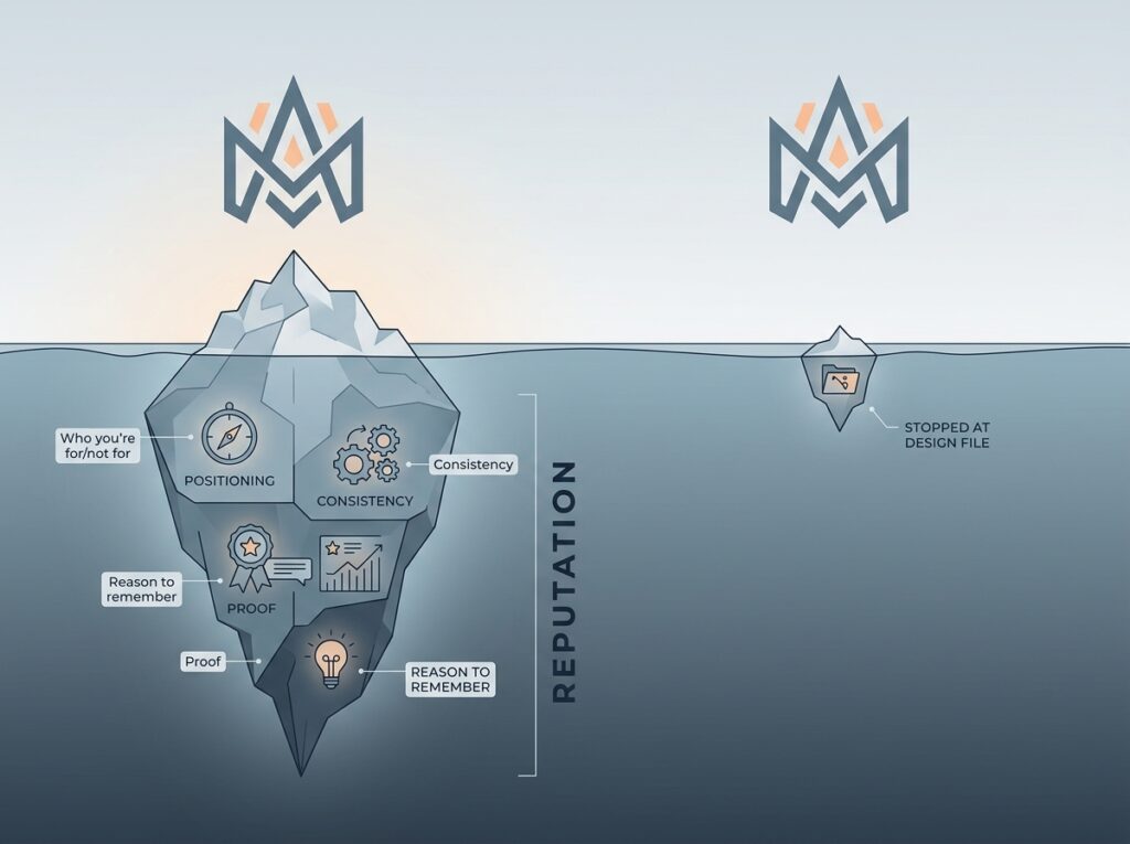
- A clear position — who you’re for, and just as importantly, who you’re not for
- Consistent experience — the tone of your ad, your website, your support reply, and your packaging all sound like the same person
- A reason to remember you that has nothing to do with price
- Proof — reviews, results, case studies — that backs up whatever the logo implies
A logo can be redesigned in a week. A reputation takes years, and it’s the reputation customers are actually paying for. This is exactly why two brands can have near-identical visual identities and wildly different sales — one has done the harder, invisible work of positioning and consistency; the other stopped at the design file.
WHERE FOUNDERS GET STUCK
Most early-stage founders treat branding as a one-time purchase — a project with a start date and an end date. In reality, branding behaves more like a system that runs continuously across every touchpoint: your Instagram captions, your WhatsApp replies, your delivery packaging, your Google reviews. A stunning logo sitting on top of an inconsistent, confusing experience does more harm than a plain one applied consistently, because inconsistency quietly signals “we’re not sure who we are” to every customer who notices it.
None of this means design doesn’t matter — it absolutely does, and a weak visual identity can undercut a strong brand. But design is the packaging, not the product. The businesses that grow fastest treat their logo as the smallest visible piece of a much bigger strategic decision: who are we, who is this for, and why should anyone care six months from now.
If your brand identity looks good but doesn’t quite convert, the gap usually isn’t the design — it’s the strategy underneath it. Digital Hike builds full brand systems, from positioning to identity to the experience that carries it through every channel. Book a free strategy call, and let’s find where the gap actually is.
A useful test for any founder: describe your brand in one sentence without mentioning your logo, colours, or product features. If that sentence is hard to write, the branding work isn’t finished — no matter how polished the visual identity looks. The logo was always meant to be a shortcut for that sentence, a visual trigger for something the customer already believes. It was never supposed to be the thing doing the convincing on its own.