
5 Website Mistakes That Cost You Leads
Here’s something that trips up a lot of business owners: your website can look sharp, load fast, and have every page filled in correctly — and still fail to bring in a single enquiry.
It happens more than people admit. A site can tick every design box on paper and still leave visitors clicking away without ever picking up the phone or filling out a form. That’s because a website isn’t really a digital brochure. It’s closer to a first meeting with a potential customer, the moment they decide whether you’re worth their time.
If your site isn’t converting visitors into leads, the problem is rarely bad luck. Website mistakes that cost you leads are often small and usually come down to a handful of fixable issues. Let’s go through the five issues that come up again and again.
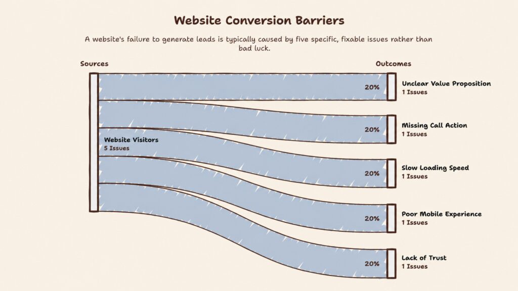
There's No Clear Next Step
Picture this: someone lands on your site, reads through your services, likes what they see, trusts the brand and then just… leaves. Not because they weren’t interested, but because nothing told them what to do next.
This is one of the most avoidable mistakes out there, and yet plenty of websites still bury their only “Contact Us” button somewhere in the navigation menu and call it a day. That’s not a strategy it’s an afterthought.
Every stage of your site should nudge visitors toward action, but not with a dozen competing options. Give your homepage a clear ask (“Book a Free Consultation”), give your service pages their own (“Get a Custom Strategy”), and let your case studies and blog posts point somewhere useful too (“Talk to Our Experts”). Think of it less like decorating your site with buttons and more like guiding a conversation ; you’re the one steering it toward a decision.
Visitors Can't Tell What You Actually Do
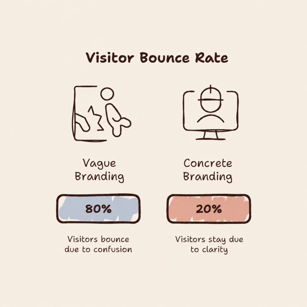
This is the big one, and it’s surprisingly common. A business builds a homepage around a clever tagline, assumes people will “get it,” and moves on. But most visitors won’t dig for answers, they’ll bounce.
Within a few seconds of landing on your homepage, someone should be able to answer a handful of basic questions in their head: What do you sell? Who’s it for? What problem does it solve? And why you, out of everyone else offering something similar?
Headlines like “Creating Better Experiences” or “Building the Future Together” sound polished but say almost nothing. They’re the kind of copy that reads well in a boardroom and confuses everyone else.
The fix is simpler than it sounds. Swap vague branding language for something concrete. Instead of “We Make Businesses Grow,” try something like “Performance-Driven Digital Marketing That Helps Businesses Generate More Qualified Leads.” Follow it with one supporting sentence and a direct call to action — “Get a Free Consultation” or “Book a Strategy Call” works fine. Nobody should have to click through three pages just to understand what you’re offering.
It Takes Forever to Load
Nobody’s patient anymore, especially online. If your pages take more than a couple of seconds to load, you’re losing people before they’ve even seen what you offer.
Speed issues creep in from a lot of directions : oversized images, bloated plugins, third-party scripts nobody remembers adding, hosting that was fine three years ago but hasn’t kept up. None of it is intentional. It just accumulates. This is one of the major website mistake that cost you leads.
Run your site through Google PageSpeed Insights and see where it stands. From there, the fixes are mostly housekeeping: compress your images (WebP is worth using where you can), strip out plugins you’re not actively relying on, cut tracking scripts that add weight without adding value, and take an honest look at your hosting if traffic has grown since you last checked. Don’t forget mobile performance either — plenty of sites are fast on desktop and sluggish on a phone, which brings us to the next problem.
It Doesn't Actually Work on Mobile
A site that looks great on a laptop can fall apart completely on a phone; tiny text, buttons that are impossible to tap accurately, images spilling off the edge of the screen, forms that are a chore to fill in with your thumb.
Given how much browsing now happens on mobile, this isn’t a minor cosmetic issue. It’s often the difference between getting an enquiry and losing one.
Responsive design is the baseline, not the finish line. The real test is using your own site on your own phone and being honest about the experience. Can you tell what the business does in a few seconds? Can you find the information you actually came for? Can you tap the call-to-action without missing it twice? Can you fill out the form without getting frustrated? If your business relies on enquiries, make sure your phone number and WhatsApp option are one tap away, not buried in a footer.
There's Nothing to Prove You're Trustworthy
Before anyone reaches out to a business, they quietly ask themselves whether it’s worth the risk. A website that doesn’t answer that question even implicitly tends to lose the benefit of the doubt.
Here’s a simple way to think about it. Imagine two competitors offering the same service. One site just lists what it does. The other shows testimonials, case studies, client logos, certifications, past work, and a few real numbers. Almost everyone gravitates toward the second one, even if the service itself is identical.
Trust signals don’t need to be elaborate. Real client feedback, a few case studies that walk through a problem and the result, a portfolio if it’s relevant to your work, recognizable client logos where you’re allowed to use them, and a short note on your team or credentials all go a long way. And skip the vague superlatives like “we’re the best agency out there” convinces nobody. A line like “generated 300+ qualified leads across multiple industries” does far more work, because it’s specific and checkable.
One More Thing: What Happens With the Visitors Who Aren't Ready Yet
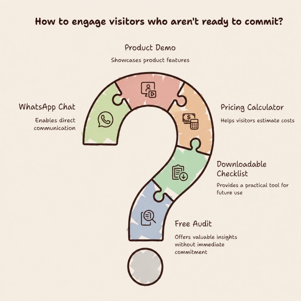
Fixing all five of the above puts you in good shape but there’s a follow-up question worth asking. What do you offer someone who’s interested but not ready to commit today?
Not every visitor converts on their first visit, and that’s normal. A free audit, a downloadable checklist, a pricing calculator, a product demo, or even just a WhatsApp chat option gives you a way to stay in the conversation instead of losing the lead entirely. Someone researching marketing agencies today might not hire one this week but they might download your audit checklist, and that’s how the relationship starts.
Looking Good Isn’t the Same as Working Well; A polished design makes a strong first impression, but design on its own doesn’t generate leads. What actually converts visitors is the combination of clear messaging, a defined next step, fast load times, a mobile experience that doesn’t fight the user, visible proof you can be trusted, and a way to capture people who aren’t ready yet.
If even one piece is missing, you’re probably leaving leads on the table without realizing it. So take a step back and look at your site the way a stranger would. Can they tell what you do in the first few seconds? Can they reach you without friction? Does it actually work on their phone? Is there anything on the page that would make them trust you enough to reach out?
Is Your Website Costing You Leads?
If you’re still not sure whether your website is helping you generate leads or quietly sending potential customers away, that’s exactly the kind of thing worth figuring out before you spend more on marketing. Book a free consultation with Digital Hike, and we’ll look at your website, understand your offer, audience, and goals, and tell you honestly what could be stopping visitors from converting into leads. Call us at 9187138887 / 9632811130 or visit https://thedigitalhike.com/ to get started.