


How UI/UX Design Can Double Your Website Conversions
Most businesses treat their website like a digital brochure — something to point people toward, not something that actively does the selling. That’s usually where the trouble starts. A website isn’t just a place where visitors land; it’s the single biggest salesperson a brand has, working around the clock without ever taking a day off. And like any salesperson, how it looks, how it speaks, and how easy it is to follow determines whether someone buys or walks away.
UI/UX design is the part of this equation that is most often underestimated. Businesses will pour money into ads, influencer collaborations, and content, then send all that traffic to a website that quietly loses half of it before a single sale happens. Fixing that leak — not adding more traffic — is often the fastest way to genuinely double conversions.
Why "It Looks Fine" Isn't Good Enough
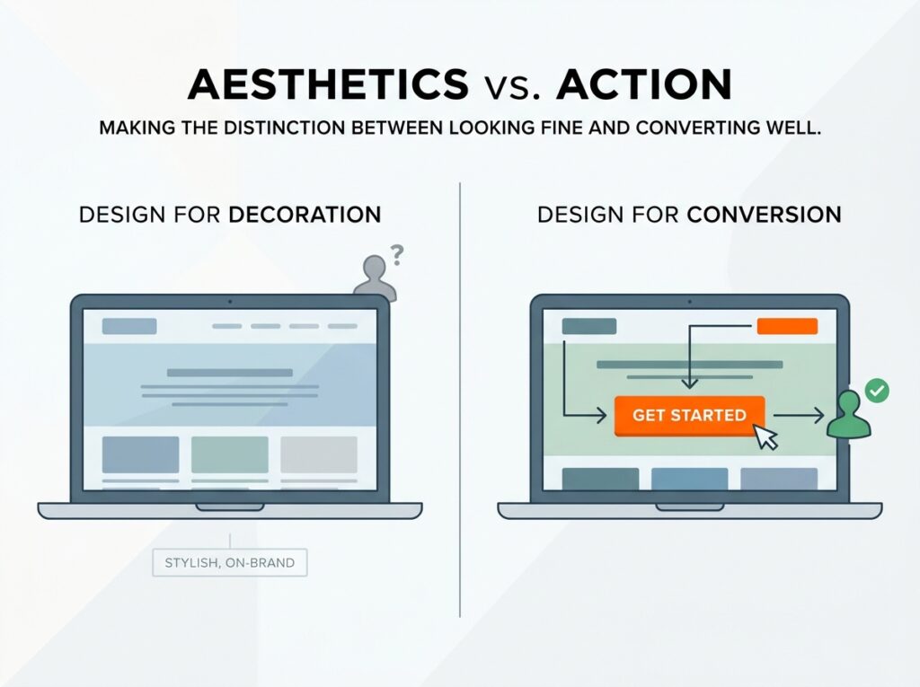
Ask most founders about their website and you’ll hear some version of “it looks fine.” That’s the problem right there. Looking fine and converting well are two completely different things. A site can be visually polished, on-brand, even award-worthy in design circles, and still fail at the one job that actually matters — moving a visitor from curious to committed.
Conversion-focused design isn’t about making things pretty. It’s about removing every possible reason someone might hesitate, get confused, or lose interest between the moment they land and the moment they complete a purchase or fill out a form. That distinction — decoration versus function — is exactly where UI/UX design either makes or breaks revenue.
First Five Seconds Decide Everything
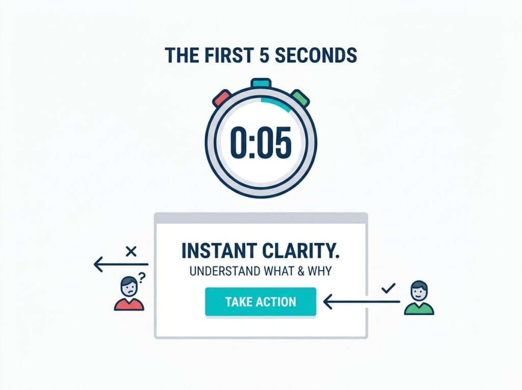
Visitors form an opinion about a website almost instantly, often before they’ve consciously read a single word. A cluttered layout, a slow-loading hero image, or a headline that doesn’t immediately answer “what is this and why should I care” is enough to send someone straight back to the search results or the Instagram feed they came from.
Good UI design respects this. It leads with clarity over cleverness — a strong headline, a clear value proposition, and a visible next step, all within that first screen. There’s no scrolling required to understand what’s being offered. The visitor shouldn’t have to work to figure out whether they’re in the right place.
Navigation: The Silent Conversion Killer
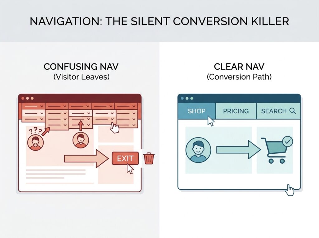
Confusing navigation is one of the most underrated reasons people leave a website without buying anything. If a visitor can’t quickly find the product they’re interested in, the pricing they’re looking for, or the information that answers their hesitation, they don’t dig deeper — they leave. Nobody has the patience to hunt through five dropdown menus anymore.
Good UX design simplifies this ruthlessly. Fewer menu items, clearer labels, a search bar that actually works, and a structure that mirrors how a customer thinks rather than how the business is internally organized. A real estate site organized by “Residential,” “Commercial,” and “Investment” makes far more sense to a visitor than one organized by internal department names. Small as it sounds, that kind of clarity keeps people moving forward instead of clicking away in frustration.
Friction Is the Enemy of Every Sale
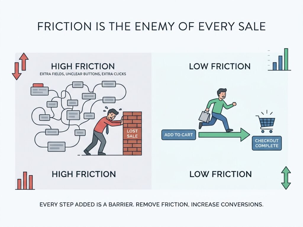
Every extra field in a form, every unclear button, every extra click needed to reach checkout — these are all forms of friction, and friction is quietly expensive. A visitor who was ready to buy can talk themselves out of it simply because the process felt like more effort than it was worth.
This shows up everywhere: checkout flows that demand account creation before purchase, forms asking for information that isn’t actually needed yet, buttons that don’t clearly say what happens when clicked. Each of these is a small tax on conversion, and they compound. A checkout process trimmed from six steps to three doesn’t just feel better — it directly increases the number of people who actually complete the purchase.
Mobile Isn't an Afterthought Anymore, It's the Main Event
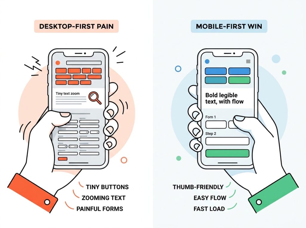
A huge share of website traffic today comes through a phone, not a laptop. Yet plenty of businesses still design for desktop first and treat the mobile version as an adjustment made later. That backwards priority shows up in tiny buttons that are hard to tap, text that requires zooming, and forms that are painful to fill out on a small screen.
Sites genuinely built mobile-first tend to convert noticeably better simply because they respect how people actually browse — quick taps, thumb-friendly buttons, minimal typing, and fast load times on mobile networks that aren’t always strong. If checkout is a struggle on a phone, a huge portion of potential buyers are being turned away before they ever reach a decision point.
Trust Signals Do Quiet, Heavy Lifting
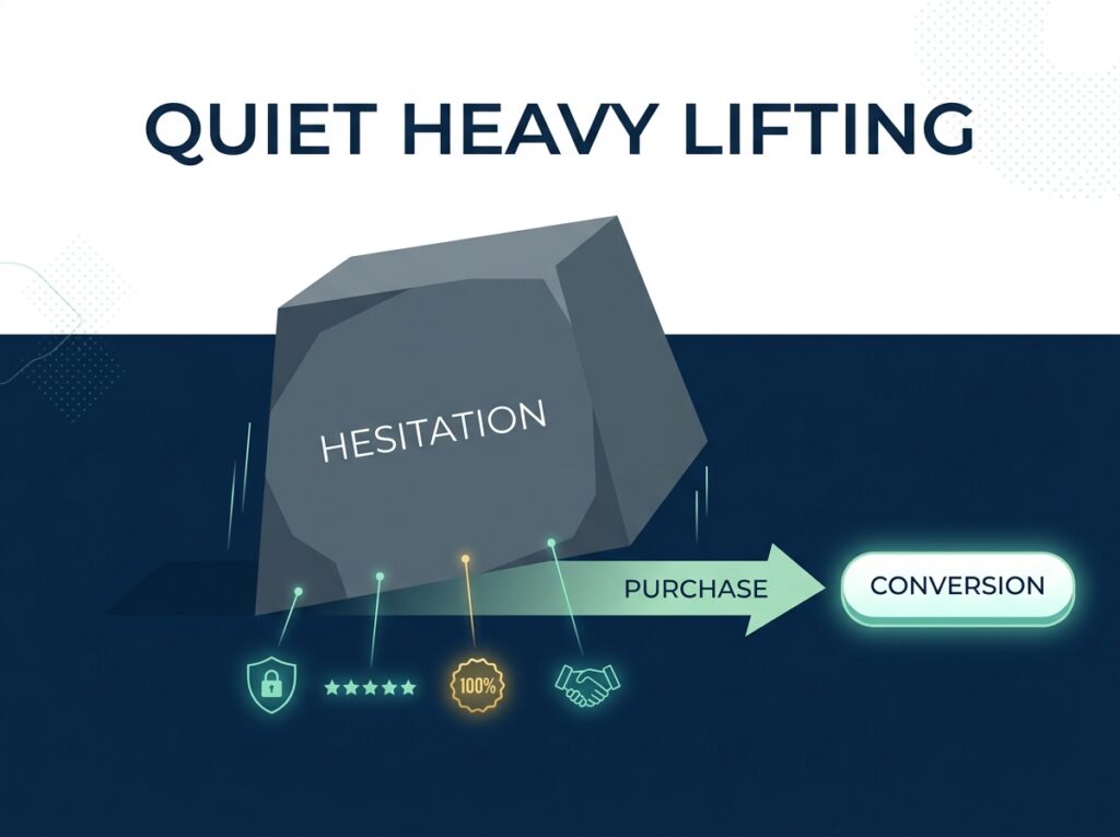
People don’t buy from websites they don’t trust, and trust is built visually before it’s built through actual product quality. Real customer reviews, clear return policies, visible security badges near payment fields, and genuine photos instead of generic stock imagery all reduce the hesitation a new visitor naturally feels.
This matters even more for newer or smaller brands without an established reputation. A well-placed testimonial near a “buy now” button, or a clear refund policy sitting right next to pricing, can be the difference between someone completing a purchase and someone closing the tab to “think about it” — and never coming back.
Speed Is Part of Design, Not Just Tech
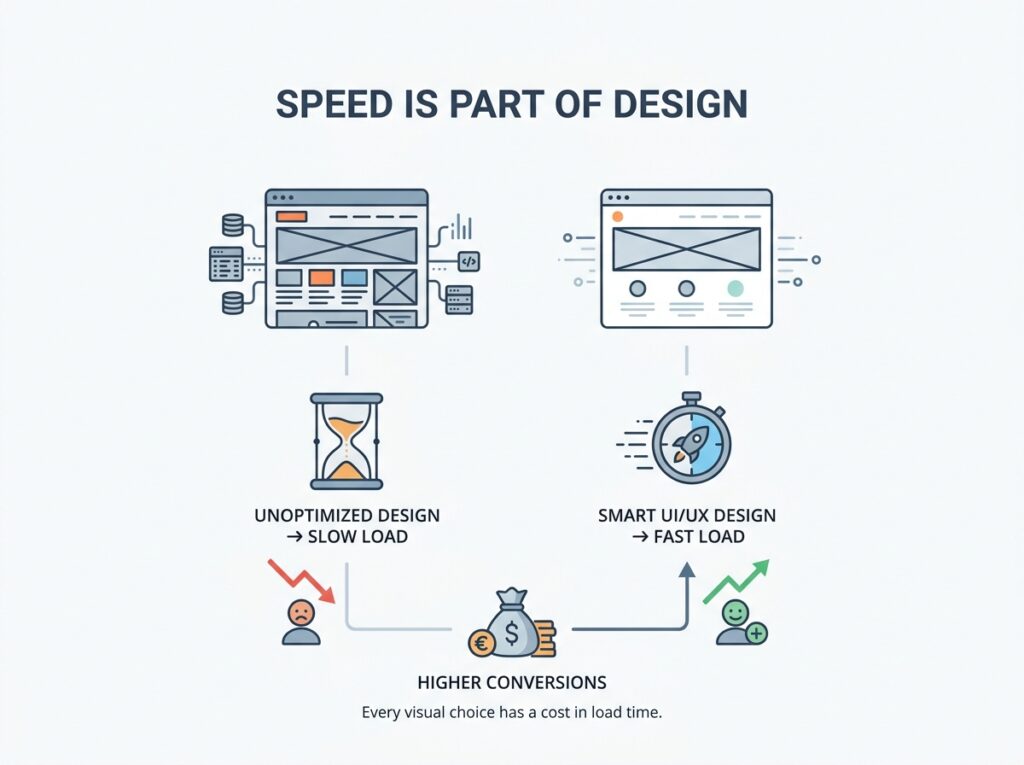
It’s tempting to think of page speed as a purely technical issue, separate from design. In reality, they’re deeply connected. Heavy, unoptimized images, bloated animations, and overly complex layouts all slow a site down, and slow sites lose visitors fast — often before the page has even finished loading.
Good UI/UX design factors performance in from the start rather than treating it as a fix for later. Every visual choice — image size, font loading, animation complexity — has a direct cost in load time, and load time has a direct cost in conversions. A one-second delay might sound trivial, but across enough traffic, it adds up to real, measurable lost revenue.
Testing Beats Guessing, Every Time
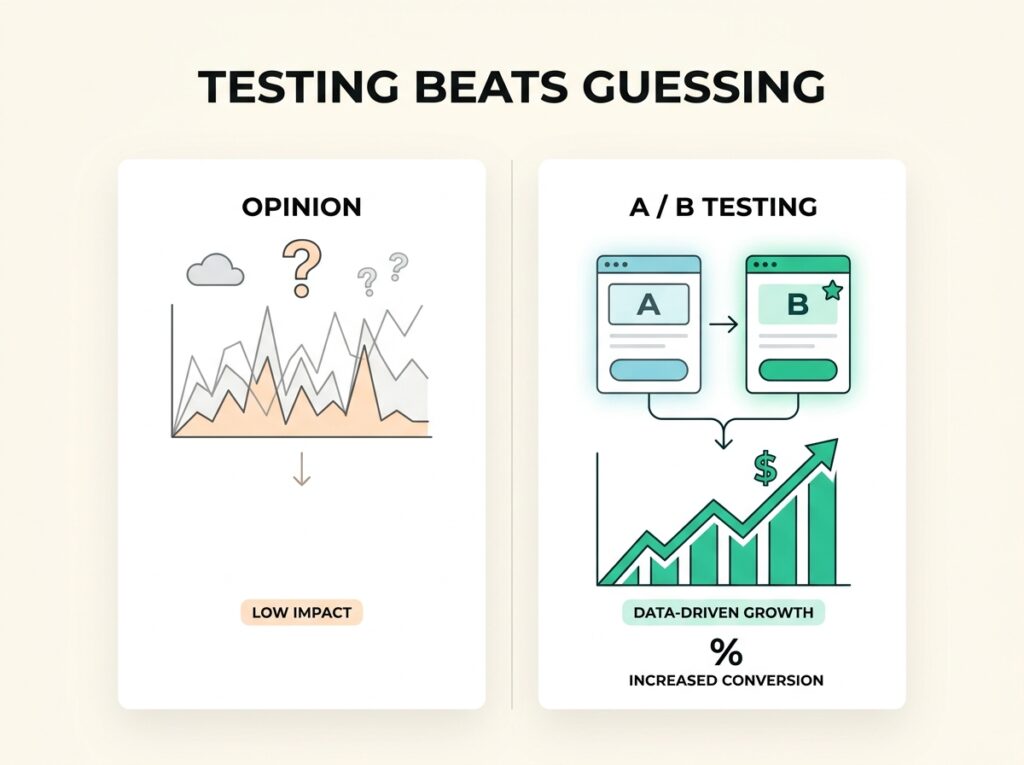
The businesses that see the biggest jumps in conversion rarely get there by redesigning once and hoping for the best. They test — different headlines, different button placements, different checkout flows — and let real visitor behavior decide what works. A/B testing takes the guesswork out of design decisions and replaces opinion with actual data.
This is where UI/UX design becomes an ongoing process rather than a one-time project. The first version of a site is rarely the best-converting version. It’s the third or fourth iteration, refined based on how real people actually behaved, that usually delivers the biggest lift.
The Real ROI of Good Design
None of this requires reinventing a brand’s entire visual identity. Often, it’s the smaller, less glamorous fixes — a clearer headline, a shorter checkout, a faster-loading homepage, a more obvious call to action — that move the needle the most. Good UI/UX design isn’t about winning design awards. It’s about making sure every visitor who arrives with genuine interest has the easiest possible path to becoming a customer.
For most businesses, the traffic isn’t the problem. The website standing between that traffic and a completed sale is. Fixing the experience a visitor has once they land is often the single highest-leverage change a business can make — and unlike ad spend, a well-designed website keeps converting long after the fix is made.